
A print-ready identity concept designed for clarity, consistency, and reliable reproduction across physical materials.

Role
Brand identity design
Deliverables
Logo, colour palette, typography, mockups
Project type
Concept project
Tools
Adobe Illustrator, Photoshop
Overview
Willow & Thorne is a print-first brand identity concept designed to feel refined, calm, and timeless. The aim was to create a clear and versatile system that reproduces reliably across a range of printed formats — from stationery to packaging.
The identity prioritises legibility and consistency so the brand remains strong at different sizes and across different materials.
Design approach
The design approach focuses on structure, clarity, and balance. The logo system is clean and adaptable, supported by a restrained palette and typography choices selected specifically for print performance.
The result is a practical identity that feels premium, dependable, and ready for real-world use.
Colour palette
Primary palette




A print-friendly palette chosen for strong contrast and reliable reproduction across common print processes and paper stocks.
Logo usage
The logo set was built to stay consistent across printed applications, with flexible lockups for different formats and sizes

Horizontal Logo
primary print use
Stacked Logo
lockup for compact print applications

Initials Mark
initials logo mark for small-scale branding
Typography
Sitka Display is used for logo and headline moments, bringing a refined tone to printed applications.
Willow & Thorne
Primary display typeface — Sitka Display
Supporting typeface — Sitka Text
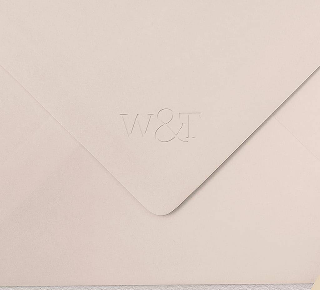
Real-world mockups
Visualising the identity across printed materials helps demonstrate practicality and consistency across formats.

Outcome
Willow & Thorne demonstrates a clean, print-ready identity system designed for reliable use across promotional and commercial materials. The concept balances refinement and clarity while remaining flexible enough for real-world rollout.