
Worklyne is a digital-first brand identity concept for a modern productivity platform, focused on clarity, structure, and efficient workflows.
Role
Brand identity design + UI concept
Deliverables
Logo, colour palette, UI mockups, digital applications
Project type
Startup concept
Tools
Figma, Adobe Illustrator
Overview
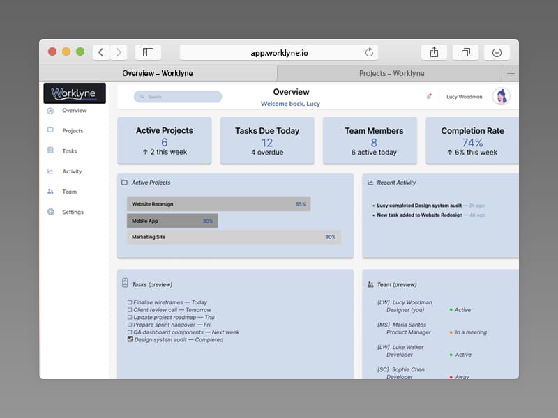
Worklyne is a digital-first brand identity concept for a modern productivity platform. The aim was to design a brand system that feels structured, efficient, and easy to use — supporting clarity and focus across everyday workflows.
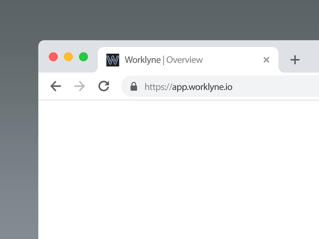
The identity was designed to translate smoothly into interface design, ensuring consistency across product UI, navigation, and browser-level touchpoints.
Design approach
The design prioritises clarity, usability, and scalability. A clean grid structure, restrained visual language, and strong hierarchy reduce visual noise and improve scanability across screens.
The result is a modern system that feels professional and practical — designed to support a product experience that’s calm, organised, and reliable.
Colour palette
Primary palette




A minimal digital palette built for contrast and accessibility. Neutrals form the foundation, with blue accents used selectively to guide focus and interaction.
Logo usage
The Worklyne logo was designed to remain clear across light and dark UI environments. Separate colour variants ensure strong contrast and consistent legibility across interface backgrounds, navigation elements, and smaller applications.

Light Version Logo
(logo on light background)
Dark Version Logo
(logo on dark background)
Typography
Typography choices were selected to support clarity and screen readability, balancing personality with a clean, functional tone.
Primary typeface — Plus Jakarta Sans
Real-world mockups
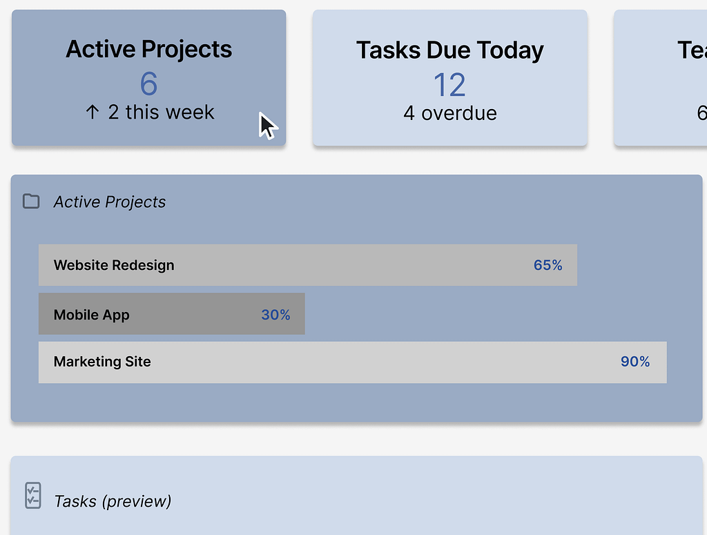
Applying the identity across realistic UI examples helps test consistency across digital touchpoints.
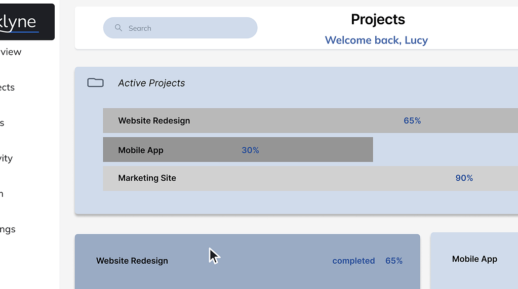
Outcome
Worklyne demonstrates a clean, scalable brand system designed for modern digital products. The concept balances structure and usability, ensuring the identity remains consistent across interface design, navigation, and key product interactions.